
Embracing a Bold New Chapter: Introducing our new brand identity.
“We are introducing IPS on a modern world stage while cherishing our foundation and celebrating our rich Mexican history, culture, and spirit. Our new brand identity is a bold declaration of who we are and where we are heading.
”
We are thrilled to share some incredible news with you — we are embarking on an exciting new journey, and it all starts with our brand identity!
As we continue to evolve and adapt to an ever-changing world, we recognize the need to reimagine our brand to reflect our values, aspirations, and service. We want our new brand to symbolize our promise to you: a commitment to continuously push boundaries, drive innovation, and go above and beyond to exceed your expectations.
Our journey toward this new brand identity has been an introspective and invigorating one. We engaged in deep conversations and scrutinized every aspect of our consulting business to ensure our new brand accurately represented our essence.
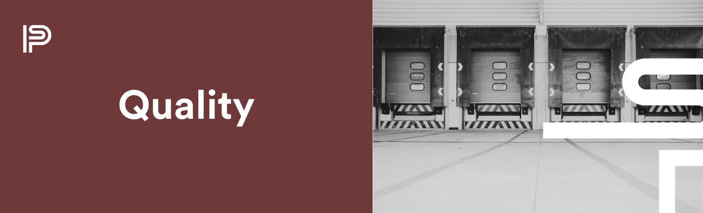
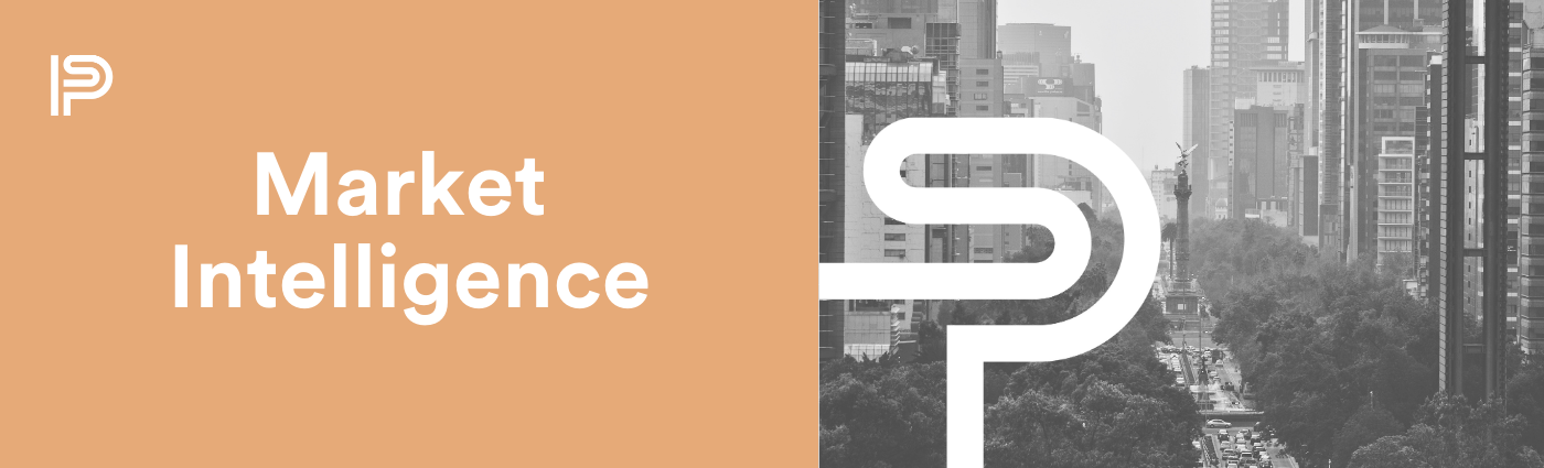
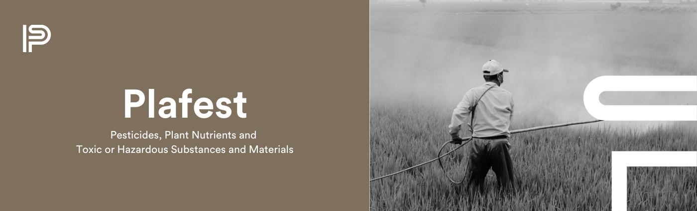
The driving force behind this transformation is our commitment to innovation, excellence, and a relentless pursuit of delivering exceptional experiences. We wanted our brand to reflect the vision, passion, and expertise that sets us apart in the industry. In addition, our goal was to create an identity not only pigeonholed with medical devices but also encompass other health industries as we expand our service offerings.


FORMING OUR NEW IDENTITY
We are introducing IPS on a modern world stage while retaining its foundation. Our goal is for our clients and partners to have an experience of a professional and close brand. For this, we generated a visual identity system that responds to our values and effectively communicates our services through different resources, such as a typographic palette, color palette, and secondary graphic elements.
LOGO
We wanted to preserve the essence of the 1993 logo and adapt it to a memorable, timeless isotype that reflected our Mexican identity. The Mexcellent typography influences it with an iconic emblem design and a unique linear typeface.

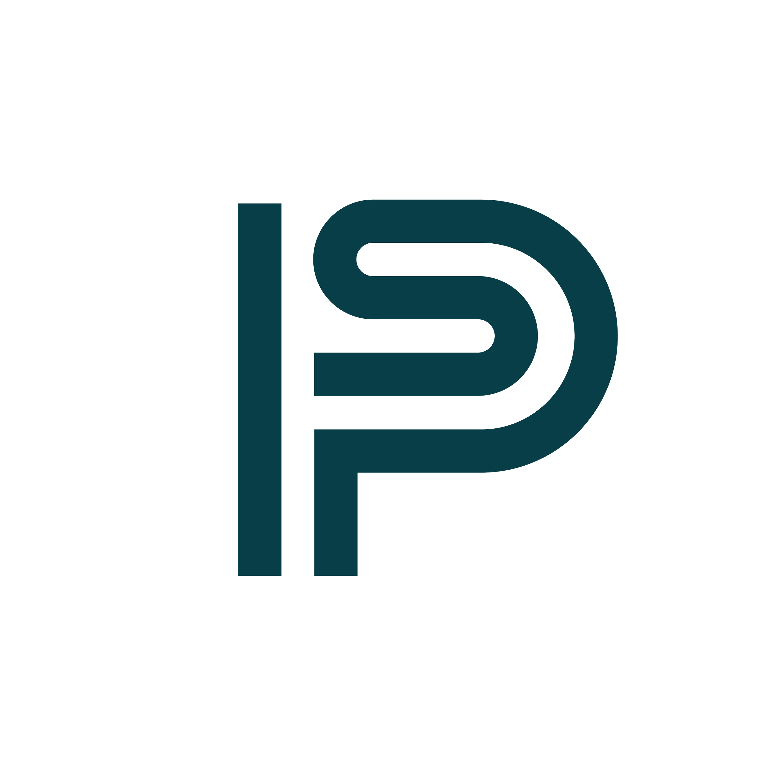
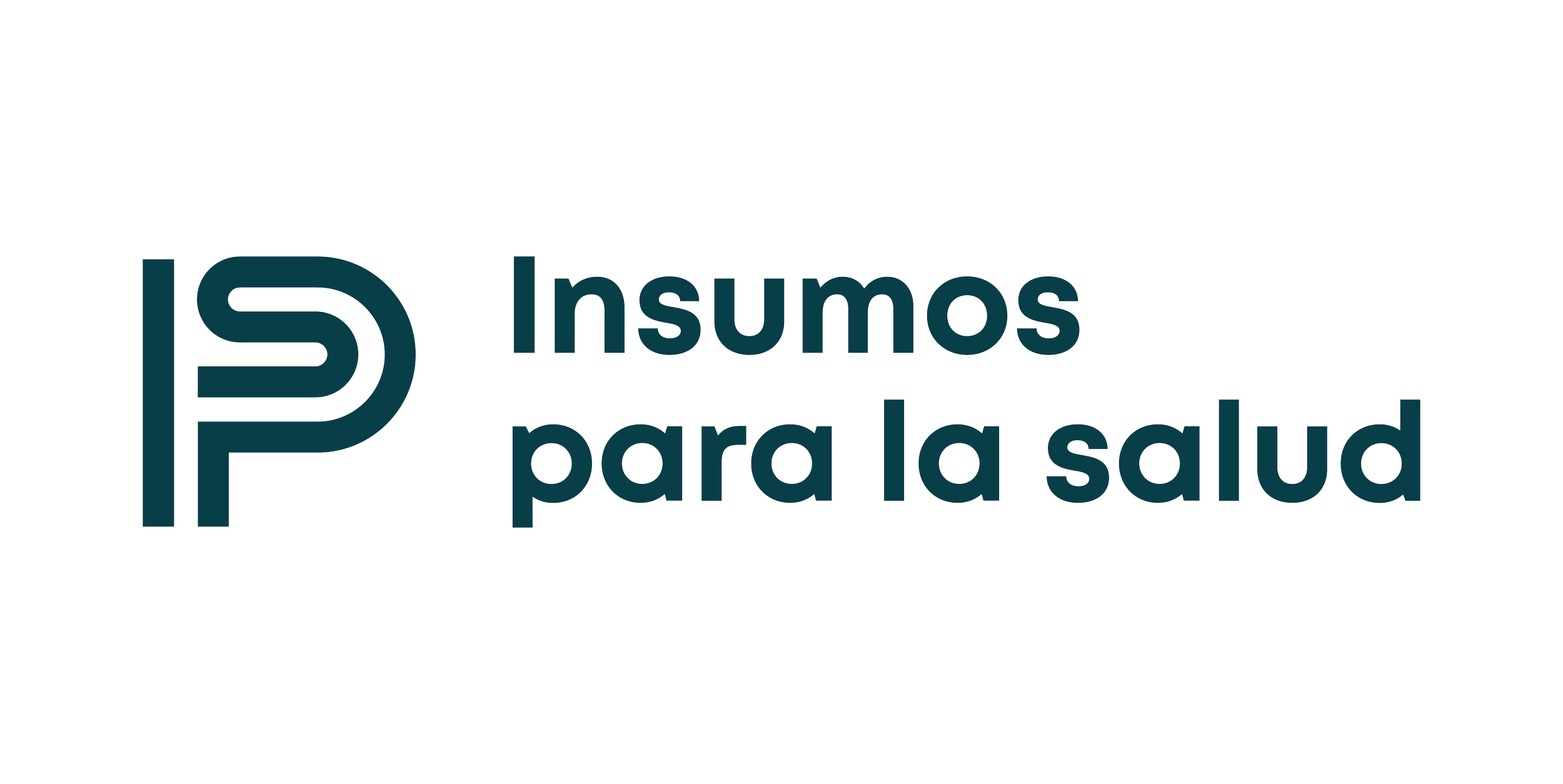
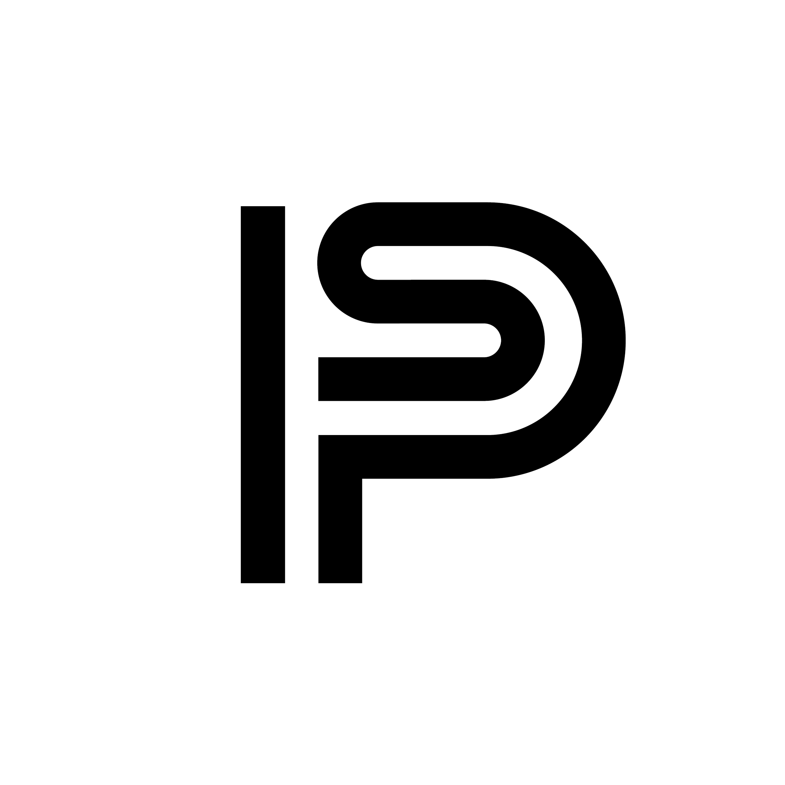
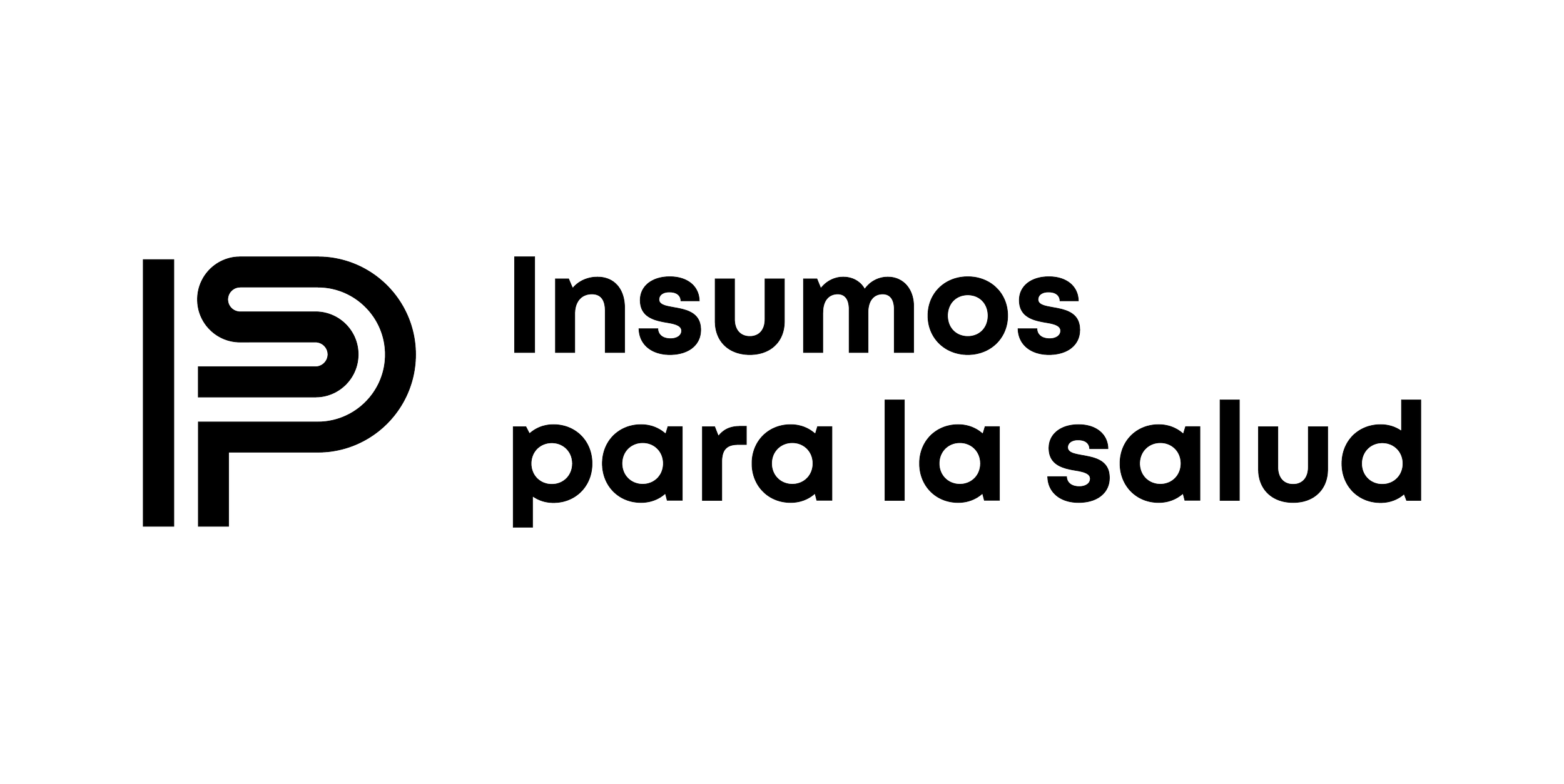
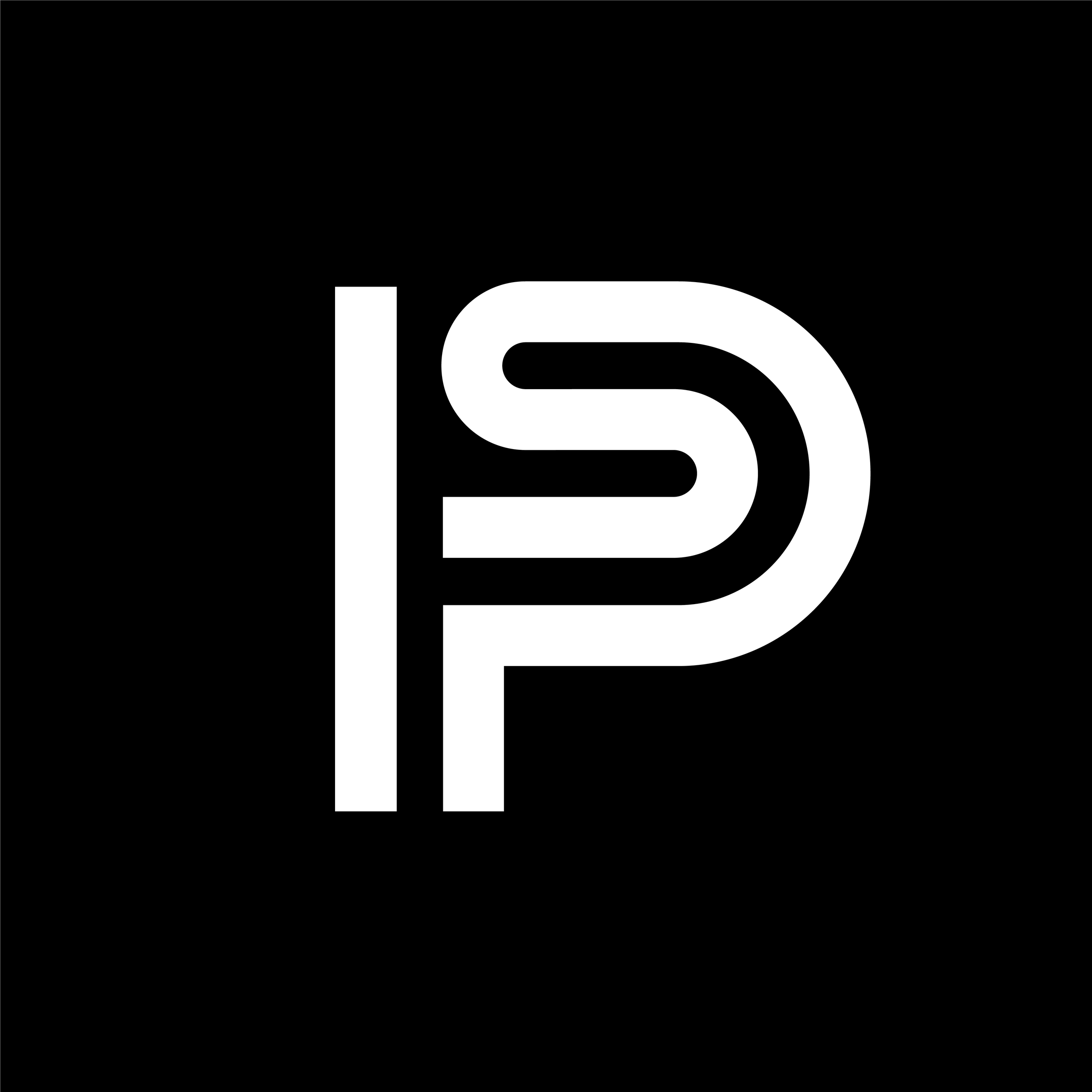
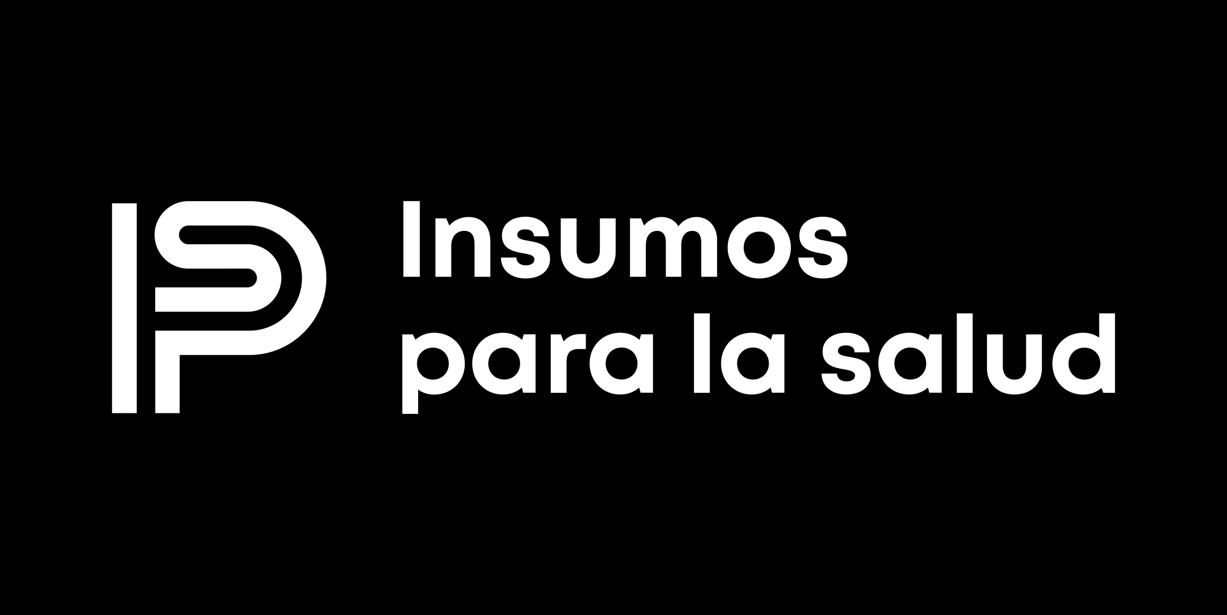
Our new logo is dynamic, solid, bold, weighty, and modern. Without going far from the old identity, we added more focus on perfectionism (represented by the bold fonts) and also went for a more mature and solid typeface.
INSTITUTIONAL COLORS & COLOR PALLET
We gave an identity to each of the areas that form IPS. We were conscientious in preserving the color blue for medical devices, which has been with us since the beginning while assigning the bursting bright colors influenced by the artwork produced by the indigenous Huichol Folk Art. These colors contrast with the institutional green, black, and white since, by delving into what IPS is, our clients and allies will experience our team's diversity and the Mexican culture's identity. Such is the case that the different colors of the areas are inspired by the Olympic Games in Mexico (1968) and the Metro of Mexico City, a decade in Mexican history that created one of the most transcendental identities.

We are thrilled to present our new brand identity, and we sincerely hope you like it as much as we do. Our team has worked diligently to develop a fresh and dynamic image that truly reflects our commitment to innovation and growth. We believe this new brand identity will resonate with our loyal customers and captivate new audiences, providing a memorable and engaging experience. Thank you for your continued support, and we look forward to hearing your thoughts on our exciting new look.
Special thanks to our friends from Cantera Estudio. We are grateful for your hard work and guidance during this process.
—-
Josué Garza Director of Business Development, Operations & Marketing.